Friday, June 21, 2013

The Chinese Skills Disconnect: An Opportunity for Us?

The New York Times headline read “Degrees, but No Guarantees.” However, the story was not about the students graduating from American universities this season. Instead, it was about Chinese grads. It seems that Chinese businesses are swamped by job applications from graduating students but have few jobs to offer. At the risk of seeming to express schadenfreude, I want to point out that as bad as our economy seems for our own grads, their prospects are better than China’s.

The problem is not just that growth of the Chinese economy has slowed from its fever pitch of the previous several years. More fundamental is the nature of that economy. Like the postwar United States economy, it is growing mainly from manufacturing. You only have to prowl the aisles of your local Walmart to see the fruits of that manufacturing prowess. However, in an economy that has a very large share of low-tech manufacturing, such as the plants that produce plastic toys, rubber tires, kitchen utensils, or even iPads and other high-tech devices that are assembled by hand, there is a limited need for college-educated workers.

In the postwar American economy, millions of workers with only a high school diploma or even less education were able to find low-tech work in manufacturing plants and earn middle-class incomes. But more and more young people are getting college degrees now, despite the fast-climbing expense, because those low-skill jobs have largely vanished, exported to China, and the low-skill service jobs that remain are very low-paying.

But consider the implications for China. Think of it this way: We have not only exported the 1950s-style manufacturing capability, but also the accompanying 1950s-style skill requirements. Chinese universities are capable of churning out hordes of graduates, having quadrupled the number of college students in the past decade. But at this point in its development, China’s economy does not particularly need these grads.

A survey released last winter of Chinese young people age 21 to 25 found 16 percent of the college grads unemployed, but only 4 percent unemployment among those with only an elementary school education. This is the reverse of what you’ll find in the United States, where the May 2013 unemployment rate was 11.1 percent for those with less than a high school diploma and only 3.8 percent for those with a bachelor’s degree or higher.

There certainly is a case to be made that China is preparing human capital for the economic transition that will occur as wages rise, as manufacturing shifts to still lower-paying countries, and as their economy starts looking more like ours does now rather than our 1950s model. But what will the young grads pouring out of the universities find to occupy themselves until that shift occurs? And if that shift is somehow accelerated—for example, if China’s government invests very heavily in research and development activity—what will happen to today’s huge cohort of low-skilled Chinese workers?

America’s “greatest generation,” which prospered during the postwar period, has already left the workforce. They had several decades in which to enjoy the match between their skills and their nation’s economy. Among the baby boomers, who got their start in that postwar economy, many now are suffering from the shifted economy but at least had many good years of opportunity. What about China? With worldwide economic development now moving so fast, will millions of Chinese factory workers have the rug pulled out from under them as their 1950’s-style economy disappears? Or will China find some way to slow this transition and continue to disappoint the college grads? Either of these alternatives promises to cause social unrest.

There is still one more possibility: that China will do what we did with community colleges in the 1970s, only on a much bigger scale—that is, invest heavily in adult education and retool the hordes of low-skill workers for the inevitable economic shift. Online courses, in particular, could facilitate a golden age of Chinese adult education in the next decade. But consider that the online lessons won’t need to be based in China. Thousands of Chinese students are now coming to brick-and-ivy universities in the United States because of our sterling reputation for higher education. We are now pioneering online education. If we play our cards right, perhaps Chinese-language online education can be one of our hottest export industries in the next decade.

Wednesday, June 5, 2013

No, Friedman; Here's the Better Way to Get a Job

I was appalled by Thomas Friedman’s column of May 28, “How to Get a Job.”  The title indicated that the column was aimed at job-seekers and would provide advice about job-finding, but the content that followed was quite misguided. It might as well have been called, “How Not to Get a Job.”

In fairness, Friedman made one valid point: He quoted a Harvard education expert, Tony Wagner, who says, “The world doesn’t care anymore what you know; all it cares ‘is what you can do with what you know’.” Employers are losing respect for a degree as an indicator of value and instead want to know only “Can you add value?”

The root problem with the  rest of Friedman’s analysis is the unspoken assumption that all jobs are found through advertisements. Of course, in the present economy, posted jobs tend to attract floods of applicants, so the hordes of job-seekers who respond to these postings have a tough time demonstrating to employers what value they can add, and employers have a similarly tough time identifying the applicants who can add the most value. Therefore, Friedman goes into a lengthy discussion of a start-up company that claims it can devise tests to identify the most promising employees in the avalanche of resumes.

But consider that, according to some research, fewer than 15 percent of job-seekers find work through job postings. (This research was done when the economy was in better shape; I suspect the odds are worse now.) The most successful way to find jobs is to tap into the hidden job market—to identify the jobs that open and get filled without being advertised. Every job opening goes through several steps between the time when it first becomes apparent that a new hire is needed and the time when the job gets advertised. By making yourself and your skills known at any instant between those two times, you can get the job.

The procedures for connecting with the hidden job market are thoroughly spelled out in books such as What Color Is Your Parachute? by Richard Bolles and Getting the Job You Really Want by  J. Michael Farr. Briefly, it means networking. Specifically, the strategy consists of reaching out to two kinds of contacts: warm contacts, the people who already know you; and cold contacts, the people who don’t know you yet. With both types of people, it helps to focus on contacts who have good connections to the kinds of employers that hire people like you. However, unexpected connections can occur, so you should also give special consideration to anybody who knows a lot of people.

The immediate goal is not a job but an interview. In fact, the interview process is a lot easier on all parties concerned when it’s not part of a formal hiring process, so when you cold-call and ask for an interview, it’s to your advantage to say you are not looking for a job with the employer but simply want information about the kind of work the employer does. In fact, the employer may never hire you but will then be part of your network and may be able to direct you toward or refer you to another employer who is expecting to hire. So redefine what counts as an interview and don’t think it has to be for a posted job opening.

Another advantage of face-to-face encounters in the networking process is that they allow you opportunities to make a thorough case—much better than a resume could—for what value you can bring to an employer. You may make your case through any combination of what you say, the professional appearance you show, the interpersonal skills you demonstrate, and a portfolio of key accomplishments that demonstrates your skills.

This job-seeking method is not just theoretically effective; it has a proven record of success. My former boss, the late J. Michael Farr, built his publishing company on the workbook that he wrote for classes that taught this technique. A minuscule fraction of job-seekers will benefit from the high-tech, gee-whiz methods used by the start-up company that Friedman describes, but for most of us there's no substitute for networking through phone calls and face-to-face contacts.

Wednesday, May 22, 2013

How Badly Did the Recession Hit Teachers?

On May 6, The New York Times ran a story headlined “Teacher Pay Hurt by Recession, Report Says.” It summarized a report from the National Council on Teacher Quality that “looked at salary data across 41 of the country’s 50 largest school districts.”

The report found that “Average annual teacher pay increases, which included cost-of-living and contractually negotiated raises as well as increases awarded for extra years of experience, dropped from 3.6 percent in the 2008-09 school year to 1.3 percent in the 2011-12 year. (The report did not include increases that teachers may have received for extra degrees or certifications.)”

Of course, a lot of American teachers have been working in districts other than the 41 surveyed for this study. I decided to use the latest figures from the Occupational Employment Statistics program of the U.S. Department of Labor to see whether the trends in large districts differed from the trends in the country as a whole.

As a stand-in for district-based pay, I used the salaries reported for the five largest metropolitan areas: New York–Northern New Jersey–Long Island, NY-NJ-PA; Los Angeles–Long Beach–Santa Ana, CA; Chicago-Naperville-Joliet, IL-IN-WI; Dallas–Fort Worth–Arlington, TX; and Washington-Arlington-Alexandria, DC-VA-MD-WV.

For these five metro areas and for the four years 2007, 2009, 2010, and 2012, I calculated the mean of the median earnings reported for three teaching specializations: elementary, middle school, and secondary school teachers, excluding special and vocational education teachers from each specialization. I chose these four years because the difference between the first pair represents the recession, and the difference between the second pair represents the recovery.

Here is a graph showing the salary trends for teachers in these very large metro areas:

As you can see, their earnings took a large plunge with the onset of the recession. And although their earnings bounced back with the recovery, their rate of increase slowed considerably once they made up for lost ground.

To see how the large-metro trends compared to the nation as a whole, I looked at the national estimates for the earnings of these three teaching specializations over the same four years. Here’s a graph of what I found:

The national trend differs markedly from the trend in the largest metros. Rather than a plunge, recovery, and leveling-off, the national trend is steady upward progress.

Now, you may be wondering whether the trend in the size of the teaching workforce has shown a relationship with the earnings of those teachers. I plotted the size of the workforce for these three specializations, both for the nation as a whole and for the totals of the five largest metro areas, and I find highly similar trends: a very slight uptick during the recession—probably creditable to normal growth trends being maintained by the availability of stimulus money—followed by a slow downward slope as stimulus funds and other rainy-day resources were exhausted and tax revenues were not recovering as robustly as the GDP.


The lesson I take away from this investigation is that although teacher salaries in large metro areas and nationwide have followed different trends, the uniformly declining size of the teacher workforce is a reason for national concern. A young friend of mine with a recent degree in education has been unable to find a permanent teaching job in New Jersey and is poised to take a position at an international school in Santiago, Chile. I don’t know how America expects to maintain a knowledge economy while begrudging the budgets necessary to staff our classrooms.

Wednesday, May 1, 2013

Recent Trends in Work Conditions

Money isn't everything. When choosing a career, most people also consider the work conditions. Will the job be mainly indoors or outdoors? Will it involve a lot of time pressure or high-impact decisions that add stress? It's nice to be able to choose work conditions that agree with you, but sometimes the jobs that are available do not offer exactly what you want, so you have to make compromises if you want to earn a paycheck.

As the economy changes over time, there are changes in the salience of various work conditions that people deal with on the job. I decided to identify recent trends in work conditions by examining recent data about occupations and about the changing levels of employment in occupations. Which work conditions are becoming more prevalent and which are receding?

Here is the procedure that I used to track several work conditions:

  • I used workforce estimates for the years 2006 through 2012 from the Occupational Employment Statistics survey of the BLS. Note that this covers most but not all workers; self-employed workers are not included.
  • For each occupation, I multiplied the workforce size at each year by the numerical ratings for various work conditions in the O*NET database (where they are called Work Context elements).
  • For each year and for each work condition, I summed the products for all occupations and summed the workforce sizes of all occupations.
  • For each year and for each work condition, I divided the sum of products by the sum of workforces to get an overall quotient that indicated the level at which that work condition was significant for the nation’s workforce during that year.
  • Finally, I graphed the changing levels for each work condition.
Note that each chart below uses a different vertical scale, and that this scale is selected to emphasize the vertical movement of the curve. If I had plotted all the curves on a single chart, the vertical movement of some of the curves would not have been as evident. I'm more interested in the direction of movement than in the absolute value of the movement.

The first two charts show the trends for outdoors and indoors work. (Actually, in O*NET, the specific work conditions I used were "Outdoors, Exposed to Weather" and "Indoors, Environmentally Controlled.") As you might expect, the two curves are almost mirror images, and the general trend is away from outdoors work (although there has been a leveling-off in the most recent years). One factor contributing to that trend is the increasing mechanization of agriculture. Another factor is the decline in construction work that followed the collapse of the housing bubble.


You may wonder why the two preceding curves are not exact mirror images--why indoors work falls off very slightly during the recovery even though outdoors work does not pick up by a comparable amount. I found that the slight dip in indoors was offset by slight increases in work done in interior environments without climate controls (such as the jobs done by some warehouse workers and mechanics) and in enclosed vehicles (such as the jobs done by transportation workers and many sales workers). These mini-trends reflect the job growth that happened following the Great Recession, in which office jobs did not return as fast as some skilled blue-collar jobs.

You can see more evidence of this mini-trend in the following chart, which shows the trends in sedentary jobs.This chart shows a curve almost identical to the curve for indoors work.


The trend in what O*NET calls "Degree of Automation" may surprise you by its downward slope. Isn't automation constantly increasing? Understand that the curve represents not the amount of automation being used but rather the number of workers whose jobs involve a lot of automation. Most employees in manufacturing have worked with automation for a long time, so when automation reaches the point that it eliminates a manufacturing job, that's one less automation-related job. An additional drain on automation-related jobs was occurring in the years 2006 through 2009, when many highly automated jobs were being shifted to plants in foreign countries.

On the other hand, you'll note that the slope has pretty much leveled off in the most recent years. I interpret this to mean that automation is not a threat as much as it is the new normal. It's getting harder and harder to find new ways to automate jobs, and the great bulk of automation-using jobs that can be shipped overseas already have been offshored. Nowadays we're actually seeing an increase in advanced manufacturing jobs.


If automation is the new normal, what does this mean for you as a worker? It means that you need a high level of skills, either for doing the things that automation can't do (making sophisticated judgments or using people skills) or for doing the technological work of creating and programming automated equipment. And this is true no matter whether your work is indoors or outdoors, standing or sitting.


Wednesday, April 24, 2013

How Work Tasks Responded to the Recession

In a recent blog, I crunched some data to see which parts of the nation’s workforce lost the most jobs during the Great Recession and which gained the most during the recovery. I created graphs that looked at the workforce two ways: by occupational group and by industry. This week I think it would be interesting to look at the kinds of work tasks (and, by implication, the kinds of skills) that lost ground or regained it during the recent downturn and upswing.

I created the four graphs below by this method:
  • As in the previous blog, I looked at changes over two pairs of years: 2007 and 2009 for the recession, and 2010 and 2012 for the recovery.
  • I used workforce estimates from the Occupational Employment Statistics survey of the BLS.
  • For each occupation, I multiplied the workforce size at each year by the numerical ratings for the 41 generic work tasks in the O*NET database.
  • For each year and for each task, I summed the products for all occupations and summed the workforce sizes of all occupations.
  • For each year and for each task, I divided the sum of products by the sum of workforces to get an overall quotient that indicated the level at which that task was important to the nation’s workforce during that year.
  • For the recession and for the recovery, I computed the percentage change in the overall quotient for each task, thus getting a measure of how much each task became more or less salient during the recession and recovery.

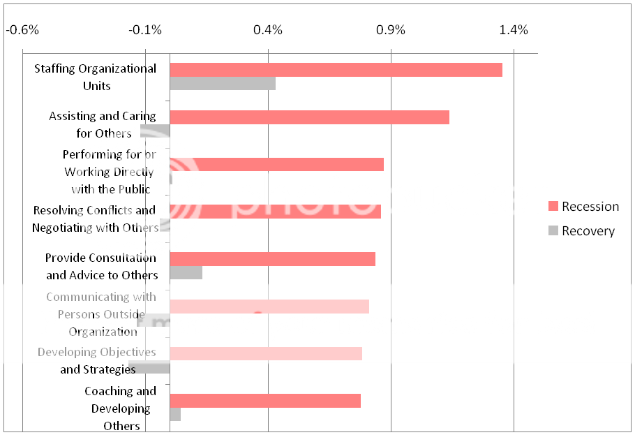
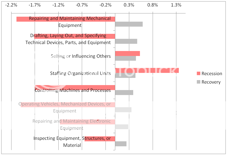
(I suggest you click on each graph to see it in a format that is big enough to read easily.)

This first graph shows the work tasks that lost the most ground during the recession. Based on the types of tasks that appear here, you can see that this downturn really deserved its nickname “the mancession.” These tasks characterize the manufacturing and construction industries, which were among those hardest-hit by the slump. Note how every one of these tasks bounced back during the recovery, but not enough to make up in two years of recovery for the erosion during the two years of recession.

But some types of jobs actually gained workers during the recession, and the second graph shows the work tasks that reflect this. These work tasks, which gained the most ground during the recession, characterize the education, health-care, and government jobs that were not fazed by the downturn. However, half of these tasks proved to be countercyclical—that is, they slid downward while the economy recovered. And even those that showed gains during the recovery did not match the gains they made during recession.


Like the recession, the recovery did not affect all kinds of jobs the same way. Some jobs actually showed a net loss of workers during the recovery, and the work tasks in the following graph are those that lost the most ground during this period. Note that every one of these did quite well during the recession, but they suffered (although not to the same extent) while the economy as a whole rebounded. These tasks characterize bureaucratic and clerical jobs, which have been hurt by government cutbacks and by automation.


The last graph shows the work tasks that gained the most ground during the recovery. Many of these tasks appear as “mancession” victims in the first chart, but two of them characterize white-collar occupations. It’s especially interesting to note the job security indicated by the steady growth of work that involves Selling or Influencing Others.

Thursday, April 11, 2013

America’s Most Creative Cities and States

Many of the most promising careers involve a high degree of creativity. This is happening because in today’s economy, much routine work can easily be handed off to computers, robots, and offshore workers. A decade ago, it was mostly low-skill jobs that got lost this way, but computers have  become smart enough to make inroads into middle-skill jobs. For example, some of the research work of paralegals is being done faster and more cheaply by computer programs.

However, computers so far have demonstrated little ability to do truly creative work. To be sure, we have all seen haikus written by computers and similar machine output that seems creative. But an algorithm defines how such tasks will be accomplished, so the creative part of the process happens when the systems analyst or computer scientist devises the algorithm. As a result, the creative worker has some security from the threat of being replaced by a computer.

Offshoring is also less of a threat for a creative worker, because the United States still is home to many hotbeds of creative industries. They are geographically clustered, just as the energy-extraction industry is clustered in certain oil patches and coal belts. You can understand that petroleum extraction and coal mining need to be located where the resources are to be found in the ground, but why should creative work need to cluster? The urban theorist Richard Florida says that creative workers are most productive when they can collaborate, bouncing ideas off one another. And the communities where they tend to cluster for collaborative work tend to have research universities, a good communications infrastructure, nearby investors, a lively cultural scene, and tolerant attitudes. The United States has many communities that offer all the ingredients of this creativity-fostering recipe.

I decided to identify these highly creative geographical areas, not by looking for the presence of these ingredients, but rather by finding the presence of creative workers. To do so, I combined data from the O*NET database, which describes the characteristics of occupations, and employment figures from BLS’s newly-released Occupational Employment Statistics survey, which has estimates for May 2012.

Here’s the procedure I used.
  •  The O*NET rates occupations on the level of “Thinking Creatively” that they require. For each occupation, I multiplied this rating by the number of workers in that occupation within each metropolitan area in the United States.
  • Then I divided this product by the number of workers in all occupations in the same metro area.
  • Finally, I sorted the metro areas by this “creativity quotient” and ordered them from highest (San Jose-Sunnyvale–Santa Clara, CA: 3.38) to lowest (Ithaca, NY: 1.85).

As you might expect, these jobs tend to be concentrated in the Silicon Valley and in similar hotbeds of high-tech industries. Here are the top 20 metro areas where creative workers are clustered, listed with their creativity quotients:

San Jose-Sunnyvale-Santa Clara, CA: 3.38
Washington-Arlington-Alexandria, DC-VA-MD-WV: 3.31
Boston-Cambridge-Quincy, MA-NH: 3.21
Huntsville, AL: 3.21
San Francisco-Oakland-Fremont, CA: 3.20
Denver-Aurora-Broomfield, CO: 3.19
Austin-Round Rock-San Marcos, TX: 3.18
Hartford-West Hartford-East Hartford, CT: 3.18
Bridgeport-Stamford-Norwalk, CT: 3.17
Raleigh-Cary, NC: 3.15
Baltimore-Towson, MD: 3.15
New York-Northern New Jersey-Long Island, NY-NJ-PA: 3.14
Minneapolis-St. Paul-Bloomington, MN-WI: 3.14
Boulder, CO: 3.13
Atlanta-Sandy Springs-Marietta, GA: 3.13
Dallas-Fort Worth-Arlington, TX: 3.13
Albany-Schenectady-Troy, NY: 3.11
Charlotte-Gastonia-Rock Hill, NC-SC: 3.11
Seattle-Tacoma-Bellevue, WA: 3.11
St. Louis, MO-IL: 3.09

Here is a map that my friend Jeffrey Doshna of Temple University produced, using the data about metropolitan areas that I furnished:


I also used the same procedure to identify the states where creative work is clustered. On the map below, the darker the color of the state, the more creative work is concentrated there. (I couldn't find a colorable map with Alaska and Hawaii, but they would be among the very pale states.)


Wednesday, April 3, 2013

Real-World Data Showing Trends in Job Security

Nobody’s job is completely secure, but some jobs are more resistant than others to the ups and downs of the economy. I have written books and blogs on this subject and have also created a video about it. Now, here is some new, real-world data that provides additional insights into this matter. The data may give you some insights into what careers you might pursue or avoid.

Last week, the Bureau of Labor Statistics released estimates for employment and wages in May 2012. I decided to look at the changes in employment in various occupational groups over two time periods: the Great Recession, which for my purposes I define as the difference in employment between May 2007 and May 2009; and the recovery, which I define as the difference in employment between May 2010 and May 2012. I find these particular dates useful because they provide symmetry: Each is a two-year period, and the employment in all occupations decreased by 3 percent in the first period and increased by 3 percent in the second period.

This symmetry ceases when you look at specific groups of occupations, and that’s what makes the chart below so useful. (You can see it full-sized here.) Note that the bars indicate change in percentage terms, not in absolute terms. Keep reading below the chart for my comments on what it reveals.


As I noted, the workforce for all occupations, taken together, declined during the recession and expanded during the recovery by the same percentage. And some families of occupations show a similar behavior, more or less symmetrical. The Sales and Related occupations are a good example of how employment can fluctuate in response to how much disposable income consumers have and are willing to part with for nonessentials. The Building and Grounds Cleaning and Maintenance occupations and the Farming, Fishing, and Forestry occupations were probably responding to similar forces. Many of the jobs in these three categories are low-skill, and employers can lay off workers without worrying about how to replace them when the economy rallies. They lack security, but they have been able to bounce back.

There tends to be a higher level of skill among the Installation, Maintenance, and Repair occupations; the Arts, Design, Entertainment, Sports, and Media occupations; and the Architecture and Engineering occupations. Nevertheless, they show similar symmetrical behavior and illustrate how even some middle-skill occupations are sensitive to fluctuations in the economy. It’s interesting to note that among the Architecture and Engineering workers, the occupations that continued to decline even during the recovery tended to be either related to construction, which was especially hard-hit by a recession set off by the explosion of a housing bubble (for example, Architects, Landscape Architects, and Surveyors), or were at a middle-skill level at which workers could be replaced by automation (for examples, various kinds of drafters and engineering technicians). The high-skill engineering occupations tended to recover.

Among asymmetrical occupational groups, some lost workers both in the recession and in what should have been a recovery. One of the most extreme examples is the Construction and Extraction occupations, which were hurt badly by the overbuilding that preceding the recession. The good performance of the petroleum industry has been unable to offset the many job losses in this field. (Nevertheless, the long-term outlook for many construction occupations is considered good.) The non-recovery of the Office and Administrative Support occupations cannot be blamed on a similar sustained slow-down in business activity—for a contrast, look at how well the Business and Financial Operations occupations have recovered. Instead, the continuing job loss in this field is explained by the expanded use of office automation. Again, the middle-skill and especially the low-skill jobs are unlikely to come back.

Other asymmetrical occupational groups achieved some expansion during the recovery, but much less than what would be sufficient to restore the recession’s losses. Good examples are the Production occupations and the Transportation and Material Moving occupations. Both of these fields actually recovered quite well from the recession in terms of productivity but did not replace the large number of low-skill workers who were replaceable by automation. (Offshoring was also a major factor for Production jobs.)

A fortunate few categories actually experienced workforce growth during the recession and sustained this expansion during the recovery. These tend to be groups consisting mostly of high-skilled workers: the Management occupations; the Business and Financial Operations occupations; the Computer and Mathematical occupations; the Life, Physical, and Social Science occupations; the Postsecondary Teachers; and the Healthcare Practitioners and Technical occupations. The exception that is notable for the comparatively low skill of the workers is the Personal Care and Service occupations. This group is dominated by the Hairdressers, Hairstylists, and Cosmetologists; the Childcare Workers; and the Personal Care Aides—all of whom perform essential services that cannot be automated and are not easy to do without even during hard times. A mostly low-skill group comparable to the Personal Care and Service occupations is the Food Preparation and Serving Related occupations, which experienced only a very small loss in the recession. We Americans seem limited in our ability to switch from restaurants to brown-bagged and home-cooked meals, even during bad times.

Finally, several families of occupations exhibited what might be called countercyclical behavior: they gained workforce size during the recession but lost workers during what should have been a recovery. These include the Community and Social Service occupations and the Education, Training, and Library occupations. They are actually needed more during hard times than during good times, but because they are paid largely out of the public coffers, they tend to experience cutbacks a few years after the trough of the recession, when state and local governments have run out of rainy-day funds and stimulus support from Washington. They may be expected to recover as tax receipts start returning to normal levels with the acceleration of business activity, but the anti-tax climate that now dominates many parts of the nation is likely to continue to hobble these occupations. Something similar accounts for the lackluster recovery of the Protective Service occupations.

It may seem puzzling to find the Healthcare Support occupations showing countercyclical behavior, especially in contrast to the recession-be-damned growth of the Healthcare Practitioners and Technical occupations. Actually, most of the occupations in this group, with middle-skill workers such as Occupational Therapy Aides, Massage Therapists, Dental Assistants, and Medical Assistants, showed continuous growth during both time spans. What has dragged down this group as an aggregate is the nearly one-million-strong Home Health Aides, who have not recovered like the Personal Care Aides. Home Health Aides are low-skilled workers who are easy to replace when a fully recovered economy justifies hiring. Both of these care-aide occupations are projected to grow by about 70 percent between 2010 and 2020.

The take-away lesson from this chart is very similar to what I concluded in a recent blog about a similar but less-detailed chart: Your best bet is a high-skill job, or at least a middle-skill job that is difficult to automate (such as many in health care), because these not only pay well but tend to thrive in both good times and bad times. 

Our society has not yet devised a way to prevent future economic downturns. Nor are we able to agree on and apply what it takes to shorten them, as the experience of Europe (and, to a lesser extent, the United States) shows. Given that a roller coaster economy seems to be here to stay, doesn’t it make sense to pursue a career that has comparative security?

Update, following the 4/5/13 release of data from BLS: Here's a graph from the Washington Post site that uses lines instead of bars, a slightly different set of industries, and a slightly different timescale. But it shows the same trends.


Another update, because manipulating data is fun: This graph uses the same method as the bar graph above, but (like the Washington Post graph) it represents industries.